Font Services
CastleType has over 30 years of experience with clients such as Chevron (see example below), Disney, Forbes Magazine, Condé-Nast, Relic Entertainment, Butterfield Bank, and Shiseido, providing friendly, reliable service and fast turn-around at reasonable rates. For information about your specific needs, or for an estimate, please contact CastleType by email at support@castletype.com.
Custom Font Design
Whether you need a digital version of an existing typeface, or want to design a new typeface from scratch, CastleType can help you. Clients from New York to Tokyo have sought out California-based CastleType because of its reputation for friendly, professional, and efficient service.
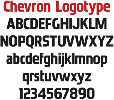
For example, CastleType created several fonts for the corporate identity of multinational giant, Chevron, including a digital version of the logotype. You've seen the Chevron logotype everywhere. But what you may not have known is that the typeface that is used for it only had about 12 letters when CastleType was commissioned to do a digital version of it in 1996. From those few letters, CastleType created a complete upper and lowercase alphabet with punctuation. Because of the extremely high x-height, certain letters (especially the lowercase 'f') were a special challenge. In fact, some changes had to be made to the original design, but they are subtle enough that (hopefully) no one will ever notice the difference!
  
Logo Digitization
If you would like to be able to type your logo in your favorite word processor or page layout program, CastleType can create a digital version of your logo, and even add it to your favorite font. Below are examples of logos that were created for Chevron Corporation (top below) and Butterfield Bank (bottom).


Digital rendering of an existing typeface
CastleType's first commissioned work was to do a digital version of the typeface Radiant Bold Extra Condensed. The client, a major department store, was using the typeface in headlines for their ad supplement to a Sunday newspaper and was spending thousands of dollars a week to have the headlines phototypeset for them. In creating the digital version, CastleType was able to clean up some discrepancies in letter widths in the original, add foreign language accents, as well as add extensive kern pairs. Other typefaces that CastleType has digitized that may look more familiar (to baby boomers, at least) are those commissioned by Spice Islands and S&W Foods, shown below.


New weights for an existing typeface
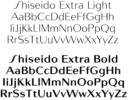
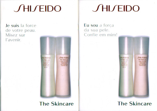
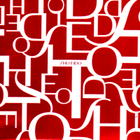
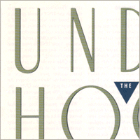
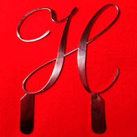
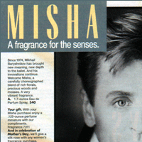
For cosmetic giant, Shiseido, CastleType was commissioned to create extra light and extra bold weights as well as clean up the digital versions of existing weights of their proprietary font designed by the world-famous Swiss type designer, Adrian Frutiger. As Mr. Frutiger "was tired of type design" at the time, he gave his permission for me to create the new weights. Under the exacting supervision of Shiseido's creative director, Kazuo Yasuhara, two new weights (as well as a subsequent medium weight) were created that complement the Frutiger originals. Examples of the new, extreme weights are shown below. One evening, while shopping at Macys, I was pleased to notice a cosmetics box cover (see above right) elegantly using these fonts in white on shiny red. I've also noticed that Shiseido is currently using the fonts that I digitized for them on their website.
In the wonderful book, Adrian Frutiger Typefaces: The Complete Works, there is a footnote in the chapter on the typeface Shiseido that states: "The Shiseido alphabet was extended over the course of time ... albeit without the participation of Adrian Frutiger." That would be referring to my work. In fact, there is a photo of a product brochure, that happens to be the same as the one I had already added here, except that the one shown below uses the new weights. You can compare the difference in the weights used with those in the book; in the sample here, Shiseido used the Extra Light and Medium that I digitized.
|
 |
• Custom Font Design
• Logo Digitization
• Font Digitization
• Extend Existing Font
|